What have I been working on?

featured image thumbnail for post undefined

Kaoshi: Sending money across borders should be easier.click to copy article link

  • Tech used:
  • HTML/CSS
  • Javascript
  • VueJS
  • Vuetify
  • Illustrator
  • Git

The story

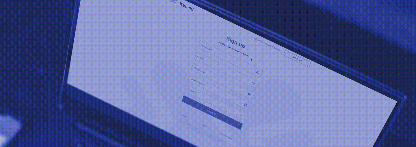
I was given the opportunity to work with a crack team of devs at an agency up in Vancouver, BC building a new application called Kaoshi. The app was a finalist for the 2019 Africa Prize for Engineering by the Royal Academy of Engineering and it looks to be a game-changer for folks in diaspora hoping to transfer funds across borders. Kaoshi had already been working on their product, but their core user experience wasn't yet designed, and their UI was in a placeholder state. They needed someone to come in and redesign some things from the ground up.

My role

I was given mocks of a couple of pages that helped me get an idea of Kaoshi's desired brand feel. I was also given some very short deadlines, and a request to focus on the desktop experience of the site first and foremost for pitching purposes. That's not generally the way one should design sites, but business needs come first. Did I mention we were on a tight deadline?

Planning

As always, it's important to start a site's design from the user's perspective. This application wasn't just going to be used in nations with snappy internet connections and up-to-date hardware. It needed to function well for a user in Nigeria who's access to the internet likely would come via a cell network on an Android phone. I did some research and found that data rates are very expensive. An entire 1/6th of the average individual's yearly salary is spent on mobile data. The site can't rely on costly videos or images. The UI will need to be as lean as possible or users will be forced to miss out.

We were on a rapid timeline for site design, and after a bit of research, I decided it would be worthwhile to use a component framework to be able to quickly bring the site's design up to spec. We went with Vuetify. I found it to be lovely, easy to work with, and most importantly, quick to implement. I could also use its tree-shaking to lower build size.

Design

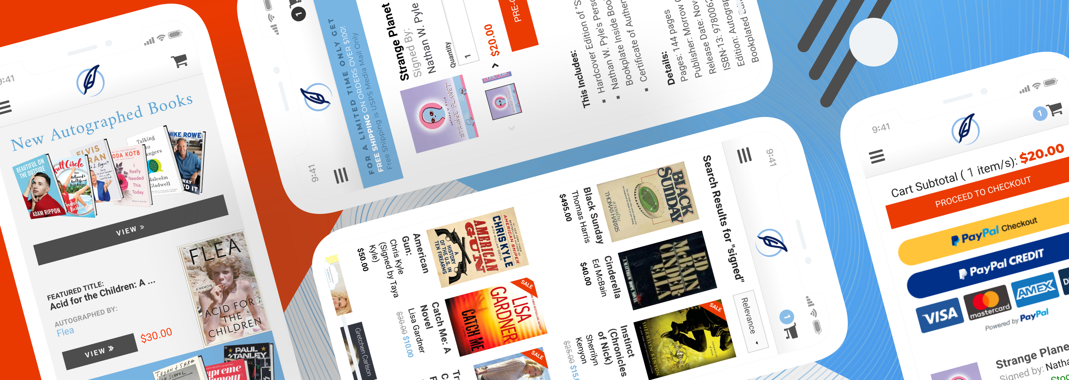
Being a fintech application, our UI needed to display a great deal of information without becoming overwhelming. I utilized lots of neutral white space, accentuated by bright, friendly, informative colors only when necessary to help things feel simpler. This alongside Material design components from Vuetify helped site interactions feel intuitive, friendly, and most importantly, familiar.

On top of all this is the fact that trust is of the utmost importance when it comes to fintech applications. After all, if a user has even the smallest question in regards to the application's trustworthiness, they likely won't use it for their financial needs. I avoided trust loss in a few ways. Color is an important factor. Cooler hues have more trustworthy connotations. Luckily, Kaoshi's primary brand colors, teal and purple, were on the cooler side of things already, but for the neutral greys and blacks across the site, we used shades with slightly more blue in them. Vuetify was also very helpful in keeping our elements feeling solid and familiar.

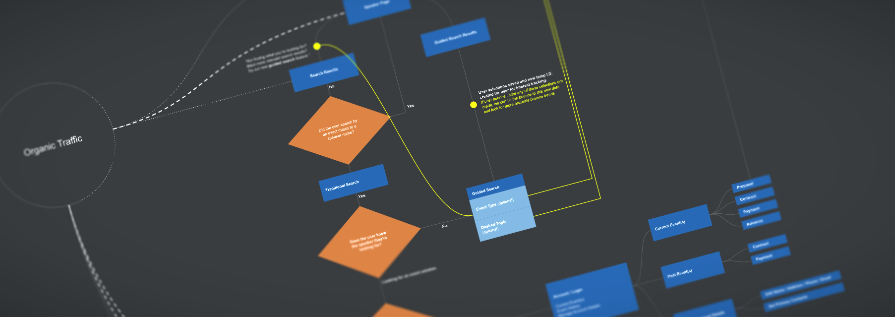
All imagery displayed is work-in-progress and taken from multiple points in time over months of development. It is not indicative of Kaoshi's final form or function.

By: Travis Franklin

featured image thumbnail for post undefined

Bulk Books: A modern, tech-focused dynamo gets a bright new look.click to copy article link

  • Tech used:
  • Photoshop
  • Illustrator
  • XD
  • HTML/CSS
  • Javascript
  • Rails
  • Marketing
  • Git

When I set out to re-design BulkBooks.com I was given three objectives:

  1. Give us the ability to directly target certain market segments.
  2. Create a means for BulkBooks.com to adapt quickly to new market opportunities and trends.
  3. Make us more modern than all of our competitors.

Here's the old site:

Bulkbooks' old site

It's a workhorse, for sure, and arguably already more modern than many of its competitors, but we knew it could be better.

Here's the new site:

Bulkbooks' new site

We made books bold and visible above the fold and drew attention to them with some basic parallax. Our CTA is pure and bold. Site visitors now know clearly what BulkBooks.com offers, and what to do about it. Search! On top of this, the site is also formatted to be more mobile-friendly as we have seen market trends shifting towards more mobile purchases. This is all very exciting, but we haven't even scratched the surface of what we changed.

Verticals!

Now when BulkBooks targets a market, they don't just send users to their front page, they send them to a page with catered content, increasing user engagement through relevance. The best part about this is that more verticals can be added easily as marketing efforts expand.

Custom Articles!

We were tasked with providing a means for BulkBooks.com to rapidly adapt to market trends. This was solved through a battery of pages for articles, lists, and special categories, all designed for crystal clear readability, and SEO.

I'm happy to say that BulkBooks.com has really exploded out of the gate with its new website design focused on user relevance, throughput, and SEO. You can view the new site (along with the fancy-dancy parallax animations) here!

By: Travis Franklin

featured image thumbnail for post undefined

Gourm.et Restaurant Reviewsclick to copy article link

  • Tech used:
  • HTML/CSS
  • Javascript
  • Mapbox
  • Leaflet JS
  • A11y
  • S Workers
  • Git

The Consummate Culinary Collection for Caloric Connoisseurs

Udacity FEND Project 5

This project tests everything I have learned in the 3 months of my studies in the front-end-nanodegree program. You can view the site here! Here's a breakdown of the features:

ES6 Syntax

This web app utilizes modern ES6 syntax for its Javascript.

Responsive Design

This web app is built to responsively resize itself to any device on which it is used. It has been tested to function on the most popular phones and tablets on the market as well as traditional desktop resolutions.

desktop

On top of this, I've implemented a system for serving images that are the most appropriate for their size in the context of where they're being served.

API Handling

This web app utilizes Mapbox's API along with Leaflet JS for displaying styled fully-interactive maps on its pages. If the user attempts to visit the site offline, the site will detect their lack of access to the map's API and replace the map's content dynamically.

A11y

This web app implements the latest accessibility standards provided to us by W3C. It has been blind-tested for useability with screenreaders.

Service Workers

This web app caches requests to the site's assets. Not only does this allow the site to load much more quickly when one revisits, if no connection is available, a majority of the site will load normally (sans content that requires API access).


Resources

By: Travis Franklin

featured image thumbnail for post undefined

Testing With Jasmineclick to copy article link

  • Tech used:
  • Javascript
  • Jasmine
  • Git

Udacity FEND Project 4

This project tested my ability to use Jasmine testing suite to validate a simple RSS feed app.

Although I would advise viewers to run this locally for testing, here is a link to the GitHub pages site for this repo.

I have included a script in the html that scrolls the viewer to the bottom of the page for easy viewing of the testing area. If you would prefer the page to not behave this way, simply remove this script from the html file:

<script>
  $(document).ready(function() {
    setTimeout(function(){
    $("html, body").animate({
        scrollTop: $(
          'html, body').get(0).scrollHeight
    }, 1000)}, 900);
  });
</script>

Using Locally

To begin, open index.html in a browser.

You'll see your feedreader app once it loads in. The Jasmine testing suite will be visible at the bottom of the page.

Tests should be green, but if they are red, you'll know there is a problem.

Test Creation

It's entirely possible for you to create your own tests right in your browser. Here's an example:

   describe('the thing', function() {
     it('should not be true', function() {
       expect(something).not.toBe(true);
     });
   });

How A Test Is Built

describe

Creates a group of specs (often called a suite). Calls to describe can be nested within other calls to compose your suite as a tree.

   describe('the thing', function() {
//   it('should not be true', function() {
//     expect(something).not.toBe(true);
//   });
   });
it

Defines a single spec. Contains one or more expectations that test the state of the code. A spec whose expectations all succeed will be passing and a spec with any failures will fail.

// describe('the thing', function() {
     it('should not be true', function() {
//     expect(something).not.toBe(true);
     });
// });
expect

Creates an expectation for a spec. If things don't occur as 'expected' within the spec, an error will be generated. Multiple expectations can be added for a particular spec.

// describe('the thing', function() {
//   it('should not be true', function() {
       expect(something).not.toBe(true);
//   });
// });

Dependencies

The code for this site was primarily from Udacity, and a few common external resources were used.

By: Travis Franklin

featured image thumbnail for post undefined

Frogger Clone with Canvasclick to copy article link

  • Tech used:
  • HTML/CSS
  • Canvas
  • Javascript
  • Photoshop
  • Git

Udacity FEND Project 3

This project focused on using HTML/CSS for styling and vanilla Javascript including classes and IIFEs for controlling the interaction of sprites within the canvas API. You can access the game here.

How to play

  • Undertake a journey to the top of the game board.
  • You can navigate using your arrow keys.
  • Beware, you must pass many scary creatures on your way. Take heed not to touch them, or your precious vitality will be diminished.
  • Touch one of these foul creatures three times and you surely shall perish.
  • When you make a successful journey, your score will increase and you'll be transported back to the start to undertake another journey.
  • As your score increases, the creatures will become more difficult to evade.
  • As any wanderer knows, every journey has an end. Yours will end when your vitality reaches zero. The higher your score, the more journeys you experienced. That is your final goal.

This may sound bleak but take heart—see how far your travels will take you before you reach the road's end.

Sources:

All imagery used has been edited from their original design to better fit the medium.

  • Font Awesome (icons)
  • Heart Machine's Hyper Light Drifter (player and enemies)
  • Freepik.com (marble texture)
  • Bitgem 3D (stone textures)
  • Udacity (Floor block sprites, looping engine, image loading utility)

Future Updates

  • Add sprite animations to all entities for greater movement
  • Add extra life pickups.
  • Add score boost pickups.
  • Make individual enemy sprites randomize each time they reach the edge of the canvas to portray a better variety of baddies.
  • Add sounds and background music so it feels like a legit game
  • Add some foreground animation (like fog passing over the canvas) for better immersion

By: Travis Franklin

featured image thumbnail for post undefined

Javascript Memory Gameclick to copy article link

  • Tech used:
  • HTML/CSS
  • Canvas
  • Javascript
  • Photoshop
  • Git

Udacity FEND Project 2

This project focused on creating a game to spec using vanilla Javascript. You can view the project here!

Instructions

A star will be deducted after so many failed moves, so strain that brain!

  • After 9 Moves, you get 2 stars.
  • After 12 Moves, you only get 1 star.
  • I may adjust these scores in the future. This is as hard as the game could be.

Dependencies

  • FontAwesome 4.7
  • GreenSock's TweenMax.js (for that fancy-dancy fade-in effect)

Future Updates

  • I want some cooler icons. FA gets the job done, but something more stylized and abstract, even runic would better fit the feel. The only issue is that they'll need to be implemented using a class system similar to FA due to the way the JS is written. This is probably more work than it's worth.
  • A leaderboard would be great, although, without a database, it would only be local, and even then without cookies, all scores would be lost on page load.
  • Breaks in some mobile sizes.

By: Travis Franklin

featured image thumbnail for post undefined

Single-page Personal Siteclick to copy article link

  • Tech used:
  • HTML/CSS
  • Git

Udacity FEND Project 1

This is the first project requested of me at the Udacity Front End Nanodegree. It focused on using layout basics to build a simple portfolio-style site. The site you're currently on has replaced this project's site, but you can still view the project via Github pages here!

Required Elements:

  • at least 4 images
  • title text (h1, h2, etc.)
  • regular (paragraph) text
  • a logo.
  • Semantic HTML
  • HTML5 semantic tags such as <header>, <footer>, <article>, <section> etc. are used to add meaning to the code.
  • No <div> or <section> tags are without a CSS class or id.

Custom Design:

  • Customize images and text.
  • Customize placement of the elements on the page (grid layout) with HTML, CSS or both.
  • Customize CSS styles applied at minimum to paragraph and heading elements.
  • Grid-Based Layout

By: Travis Franklin

featured image thumbnail for post undefined

Premiere Speakers Bureau: Celebrating 25 years with a beautiful new site.click to copy article link

  • Tech used:
  • Photoshop
  • Illustrator
  • XD
  • Analytics

Redesigning PSB's website was no easy task.

The site is used daily and repeatedly by power users and booking agents scouting talent for corporate and organizational events. Every change needs to be thought through from that perspective. I can't completely upset those user's flow by moving many elements around. Instead, I focused on a few major points:

  1. Mobile useability. (their previous site was barely functional on mobile devices)
  2. Search engine optimization (recently keyword competition has intensified in the field of speakers bureaus, and I needed to implement some careful planning to ensure the site remained competitive in a way that's scalable)
  3. Optimized user throughput to conversions (after all, that is the point of this website, right?)

Here are the highest traffic pages from the old site:

It's a good site, but can definitely be improved.

Pre-planning

Before any design phase, my first step is always to gather data. I mapped primary user routes through the current site noting pages with substantial drop-off percentages. I then interviewed employees within the company who interface with users daily (sales and CS) to learn what positives and negatives have come down the line directly from our customers.

I discovered a bit of friction. PSB serves a very broad range of clients with an even broader range of topic speakers, and that can be daunting on one's first visit. They needed to land on a more relevant page to the type of speaker they were looking for, and that the current existing topic pages weren't cutting it both from a useability standpoint, but also from an SEO standpoint. They weren't showing up in search.

After gathering data, I decided it would be best to draft a flow for user traversal of the site noting paths that would get the fastest throughput to conversion. In that path, I marked areas where the highest drop-off rates currently existed so I could better address them in the design phase.

The Homepage

PSB's NEW site, homepage For the homepage, I enlarged the hero image and encapsulated the search bar in it. This afforded us a more stunning first impression, while also drawing more attention to the primary CTA on the page. The search bar (arguably the most used aspect of the page) is now larger and more centrally located for easier use. For the sake of SEO, I also focused on bringing more speaker profile information onto the front page through the use of improved speaker cards. This idea was continued with a much-improved topics section on the page. All of this was followed by a value statement section featuring a carousel of glowing endorsements, and a listing of some of the company's most recognizable clients.

The Speaker Profile

PSB's NEW site, speaker profile Arguably the most important page on the site since it's where a majority of conversions occur. This page suffered from multiple problems: 1) a lack of proper prioritization of content, and 2) A lack of preparation for when specific data in a speaker's profile is lacking. The final result is a much more thoughtful and readable layout that even makes room for speaker reviews! I also made some adjustments to the page contents to help with SEO regarding that particular speaker. Now searches for that speaker's name will begin appearing much higher in search results.

The Topic Page

PSB's NEW site, topic page The severely lacking topic page has been turned into the perfect landing page for event planners. It mirrors the home page almost entirely but populates it with content that is relevant to a topic. This allows us to link directly to topic pages when we know an event planner is searching for specific content.

The Search Page

PSB's NEW site, search page The search page has been completely redesigned and is able to show more speakers at once, with more relevant information. I also planned in a feature where users can now curate their own collection of speakers and save them for later review. These saved speakers can also be viewed by our sales agents so they can provide better suggestions to clients in the future. This data will also be helpful in the future for better determining what speaker profiles are most appealing to clients. We can use this data to help us aid speakers in creating more attractive profiles for themselves.

I hope you enjoyed this simplified look at a small part of the work that went into this fantastic site. There are many more pages to the site and even an entire proprietary back-end system that required design, but that's probably a topic for another day. You can view the site here!

By: Travis Franklin

featured image thumbnail for post undefined

Premiere Collectibles: Mobilizing for the Future.click to copy article link

  • Tech used:
  • Photoshop
  • Illustrator
  • XD
  • Analytics

The Problem

Premiere Collectibles calls itself America's Largest Autographed Book Store, but there's a problem. They are quickly losing that distinction. Book purchases are beginning to wane, and they didn't know why. They've seen incredible growth for years and years, but suddenly the market is drying up? Something isn't right.

Research

I began looking at Premiere's analytics and found that their website traffic and confirmed that their traffic had grown a great deal in the past year, but their conversions had begun to wane. The culprit was one a lot of businesses have run into in the past decade. Their userbase had grown to a whopping 70% mobile. The issue was that their site wasn't mobile-friendly at all. In-fact for many users at mobile resolutions, purchases couldn't even be made!

The old site

The new mobile-friendly layout

View it live here

The Results were immediately apparent

Chart showing site conversions from June through December of 2017. The chart spikes at the point marked by the updated site's launch and continues a much-improved trend through the end of the year. The added useability alongside the SEO benefits Google provides sites that are mobile-friendly benefitted us greatly leading into the holiday season. The company saw a nearly 30% increase in conversions compared to the previous year, and nearly 90% higher add-to-cart rate.

So if you haven't made your site mobile friendly, do it! Do it now!

By: Travis Franklin